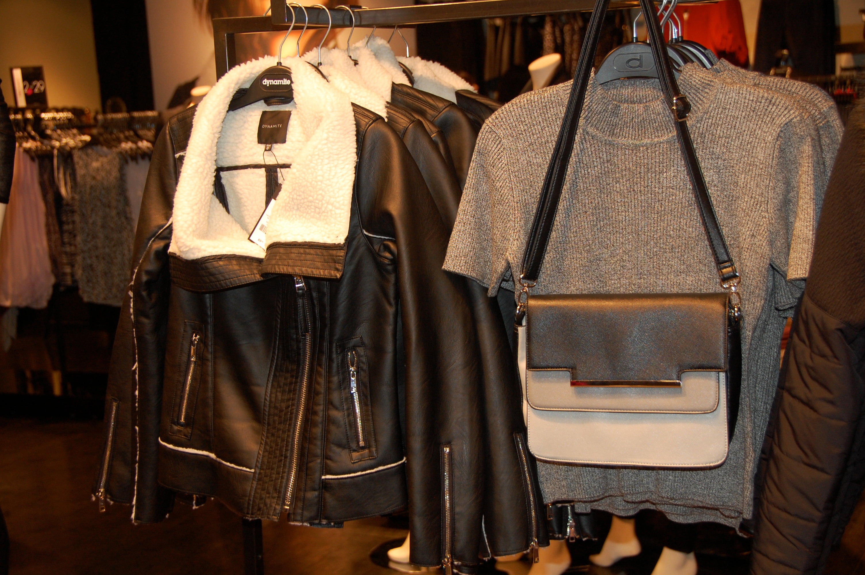
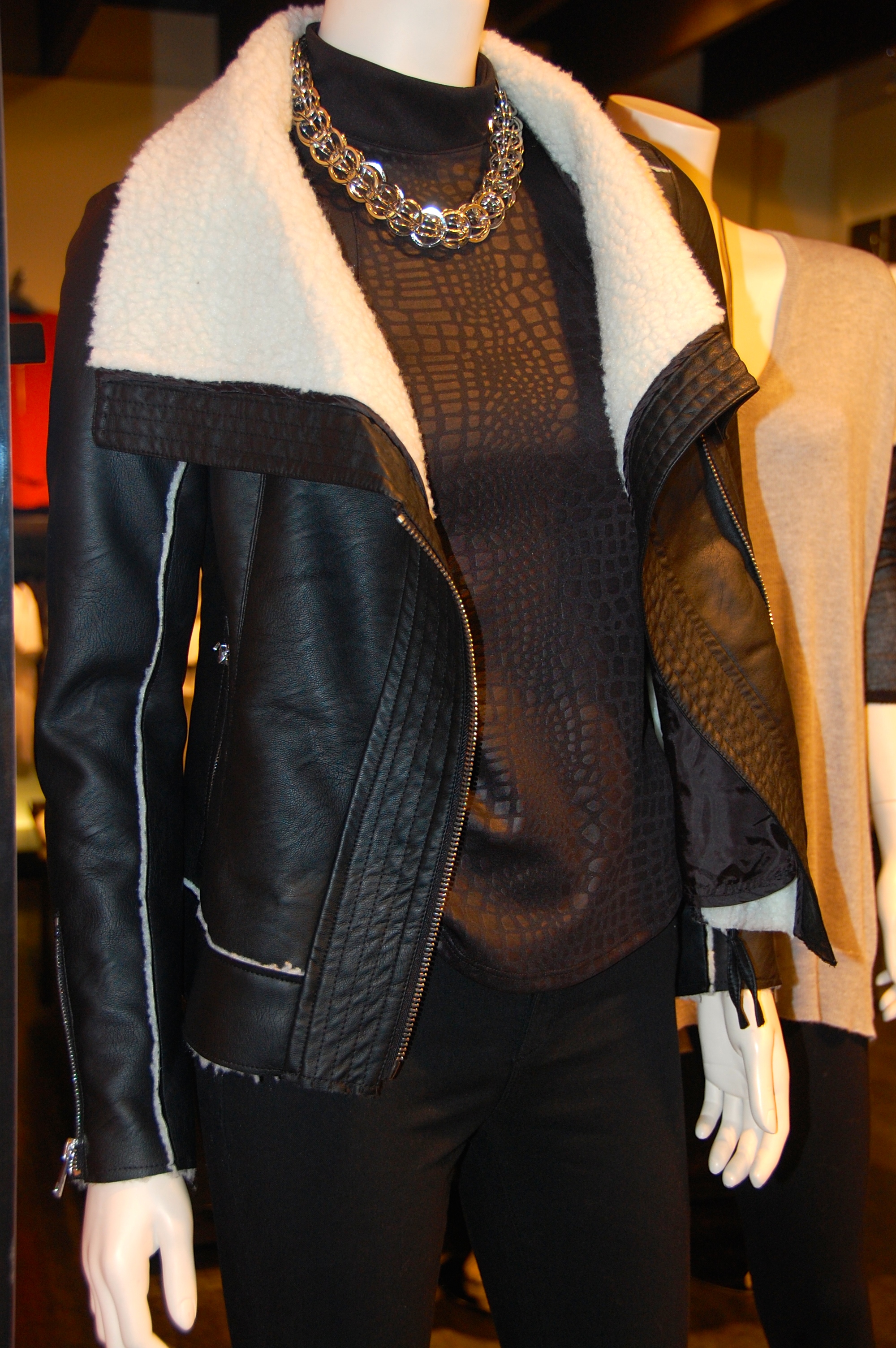
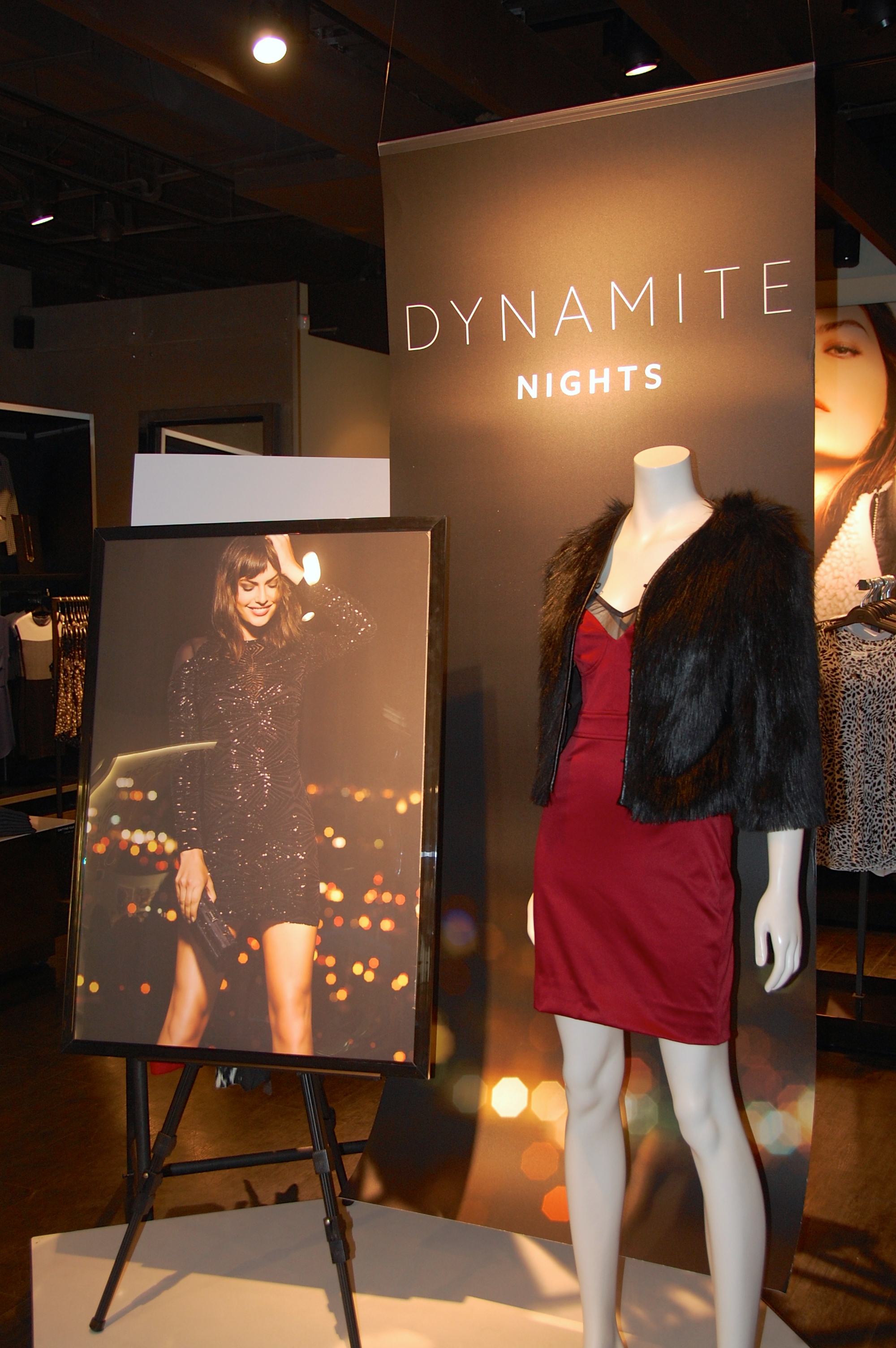
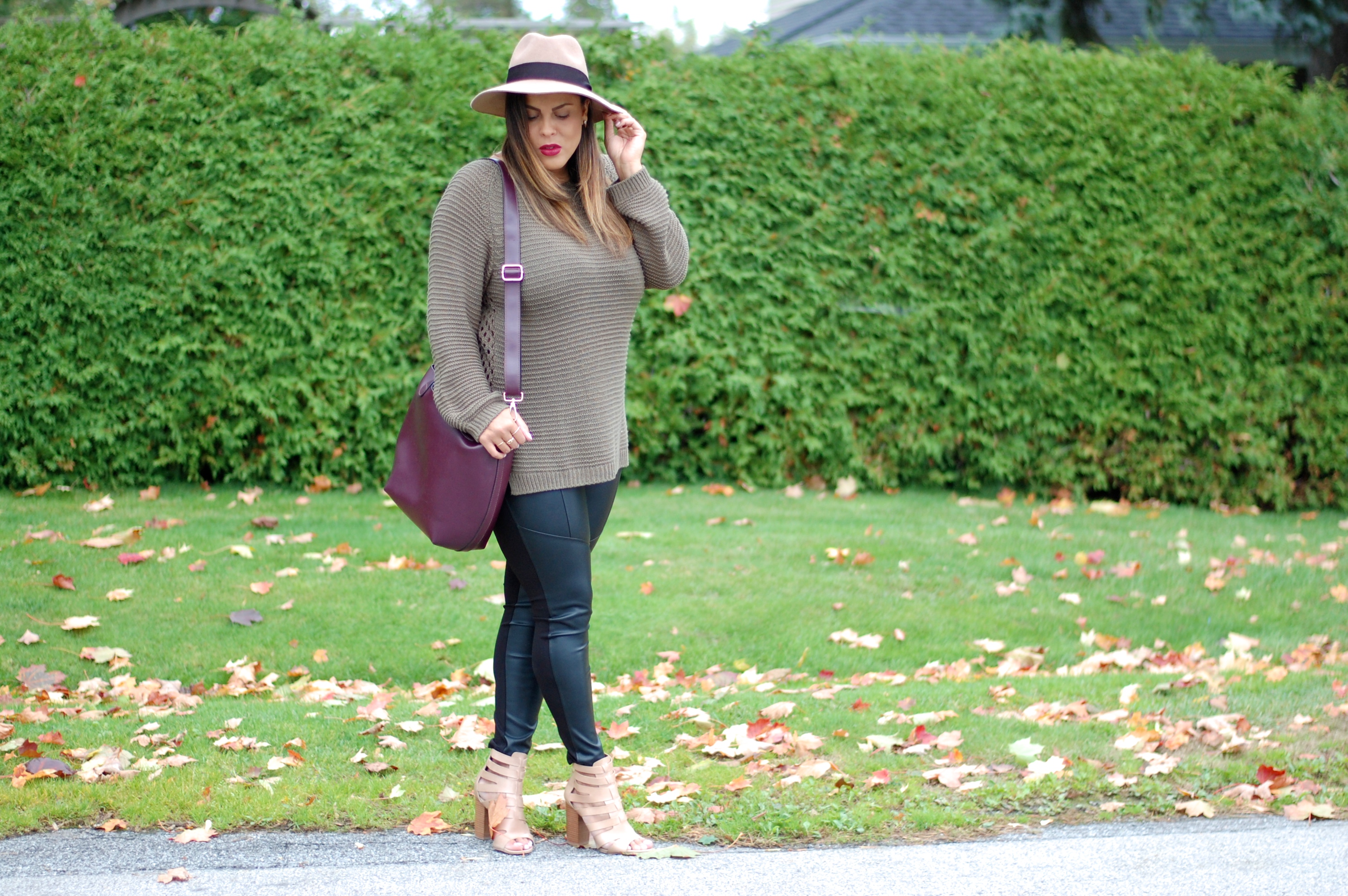
As we previously discussed here, Canadian retailer, Dynamite has recently celebrated their 30th anniversary and with that, they have expanded and gone through a makeover as well. Just the other day, I had the opportunity to see their new look while shopping their Fall 2014 collection.
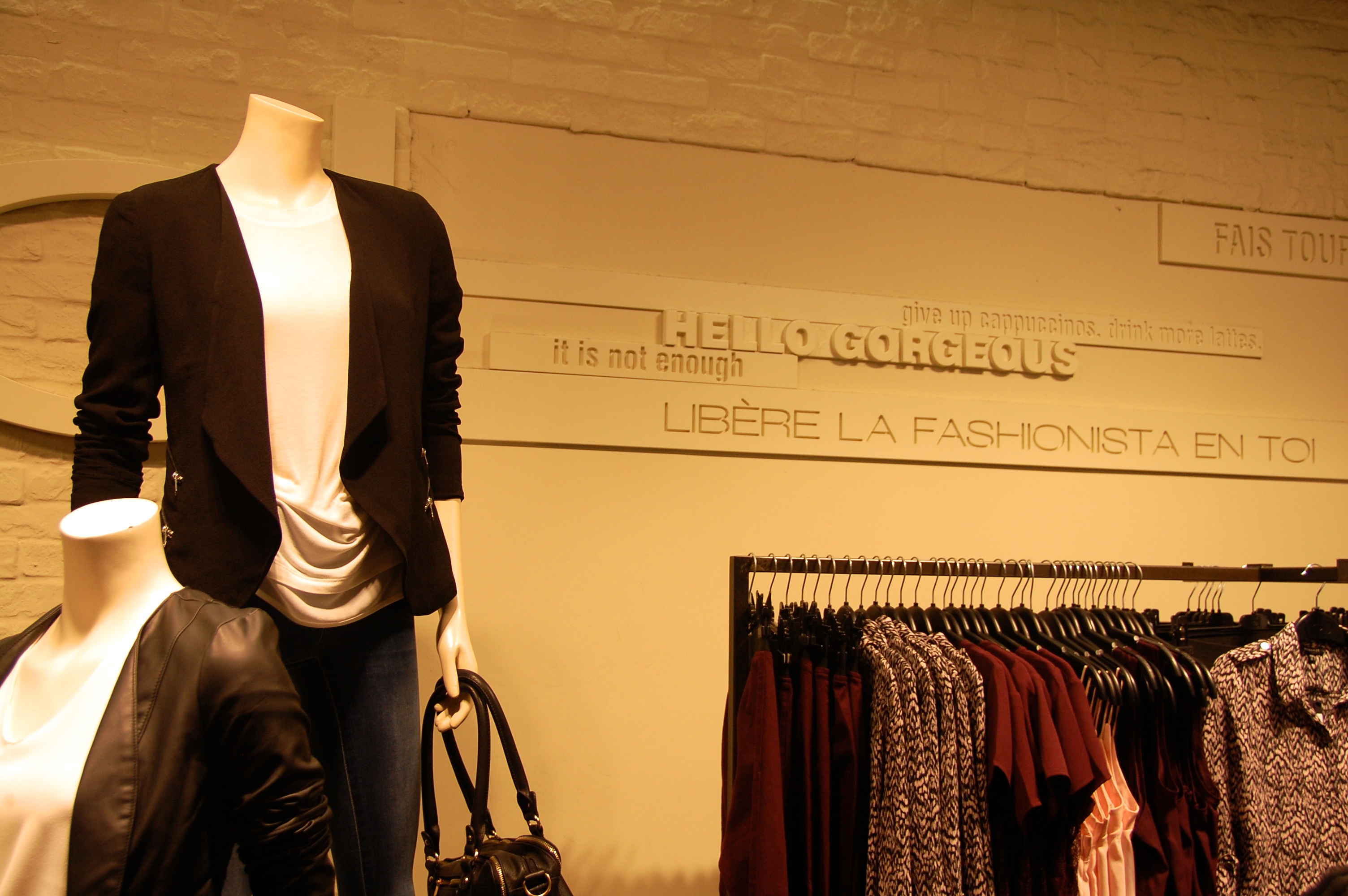
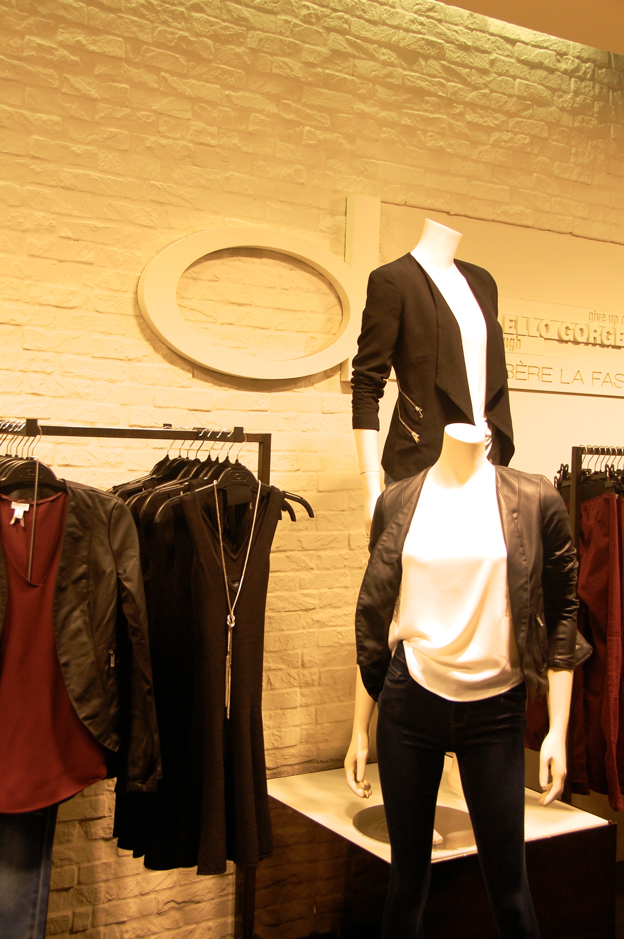
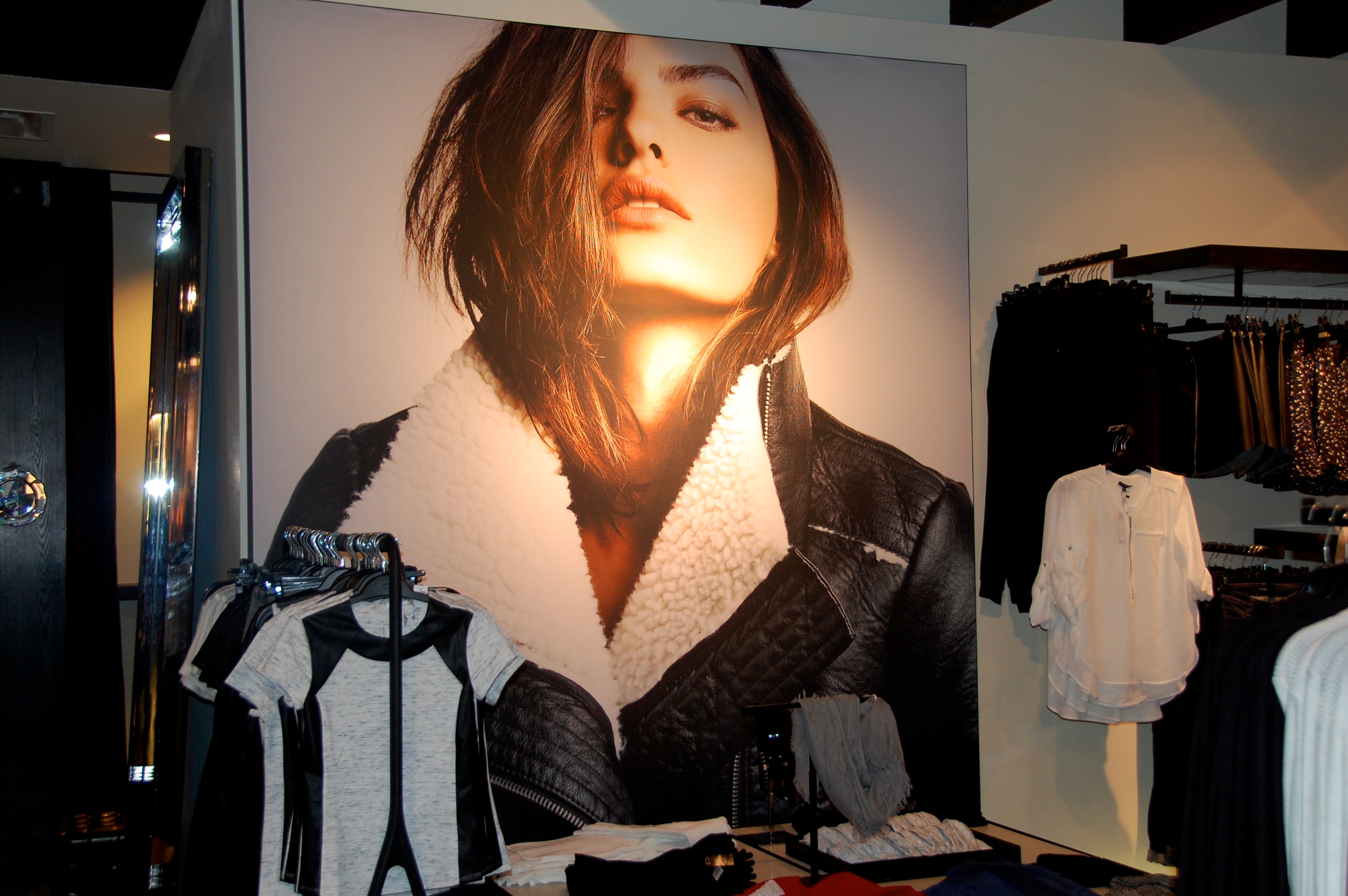
Not only were there a number of great Fall pieces to pick up this season, but as I entered the newly designed store, I quickly noticed Dynamite’s branding taking on a fresh new look. The sleek new logo and white interior store design features modern accents with a touch of glam, while the store’s new look takes on a loft-like living space which reflects the Dynamite lifestyle.
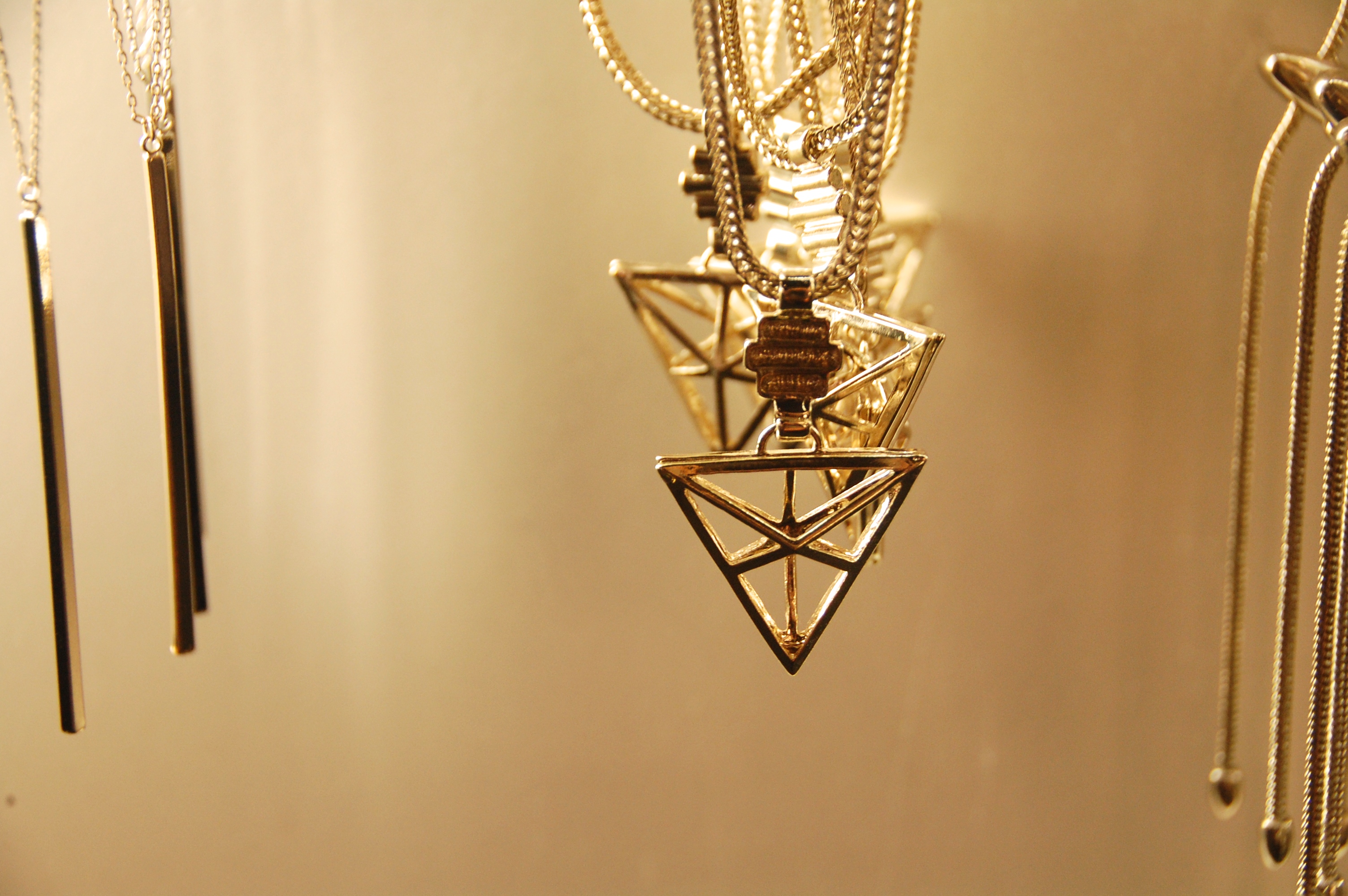
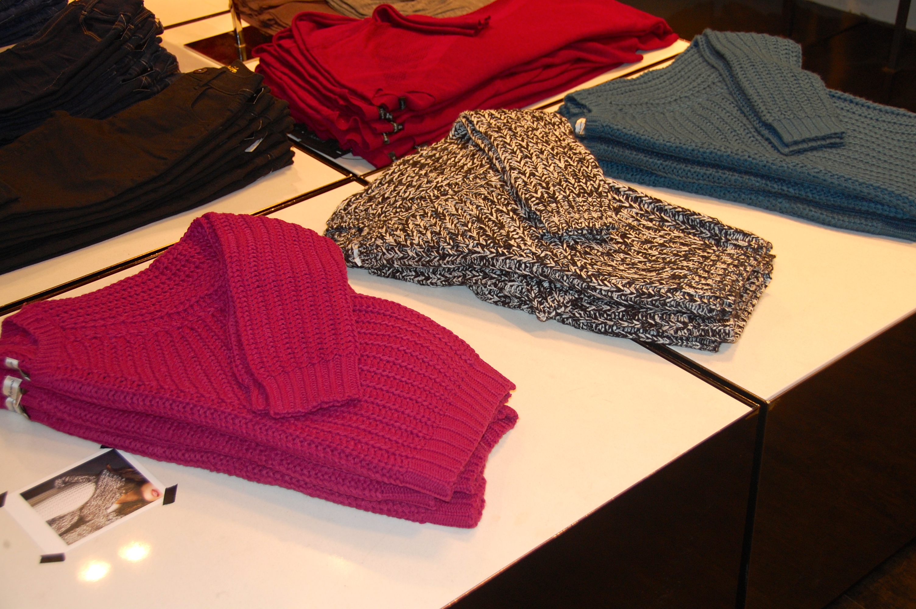
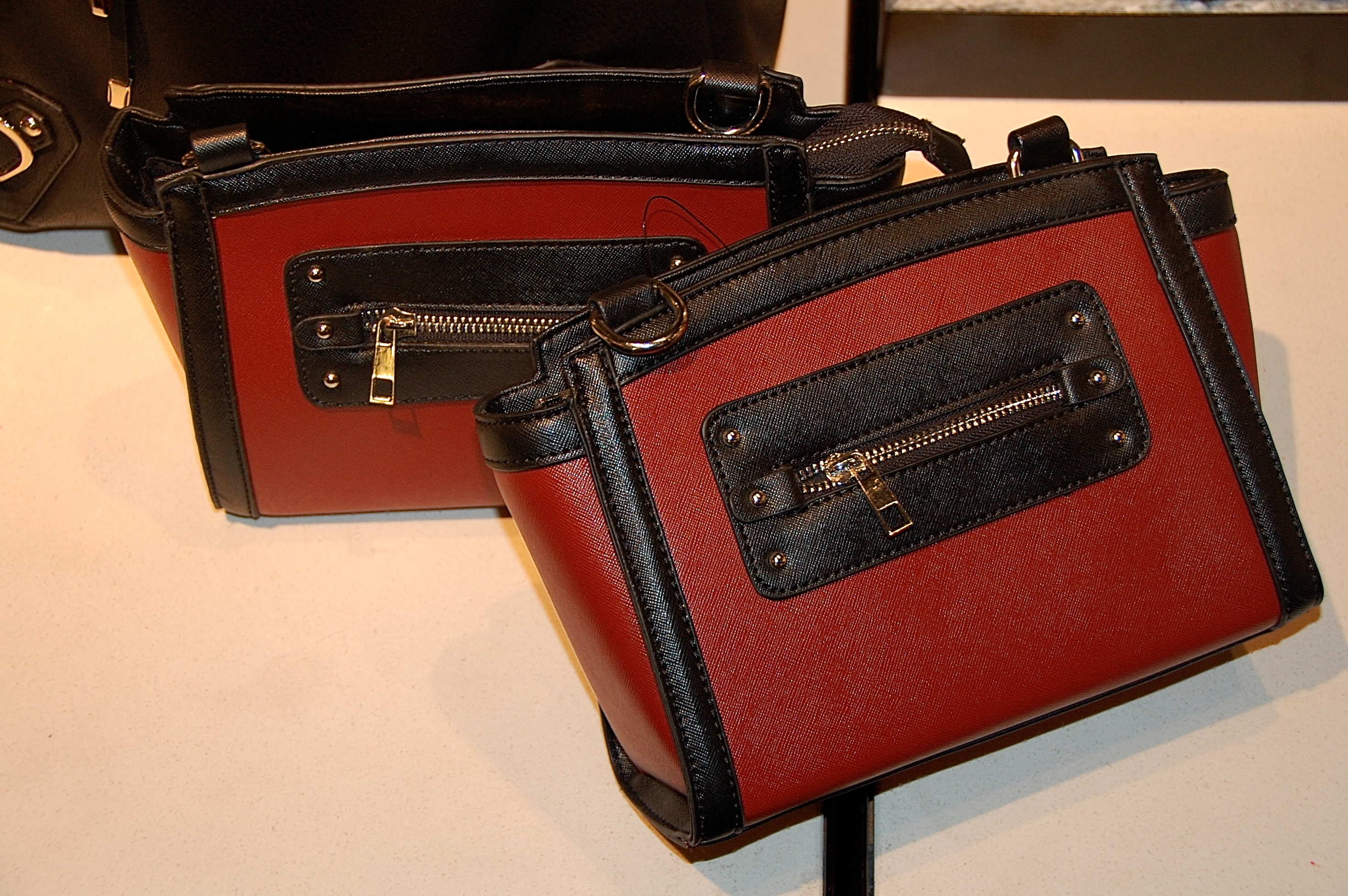
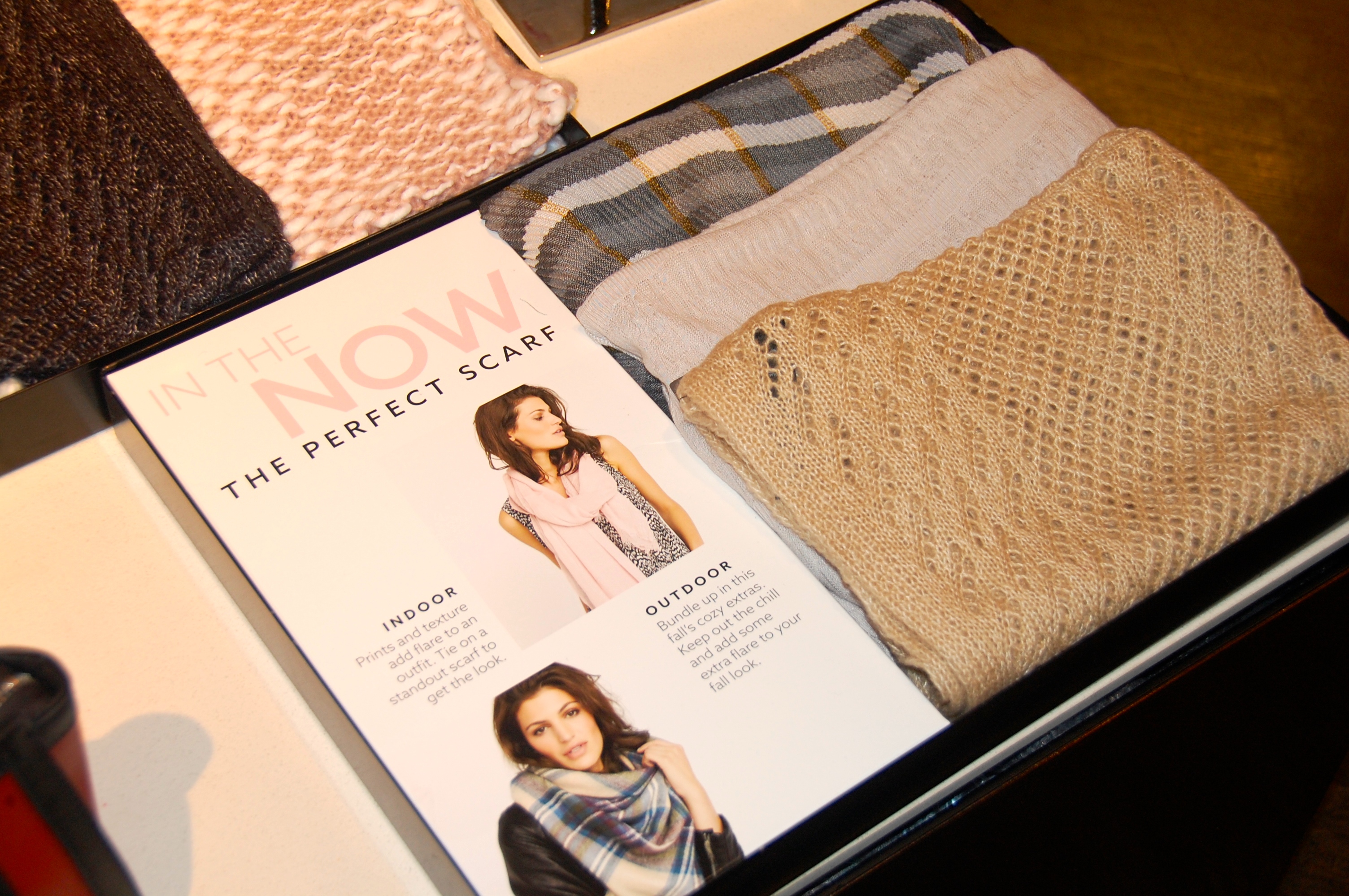
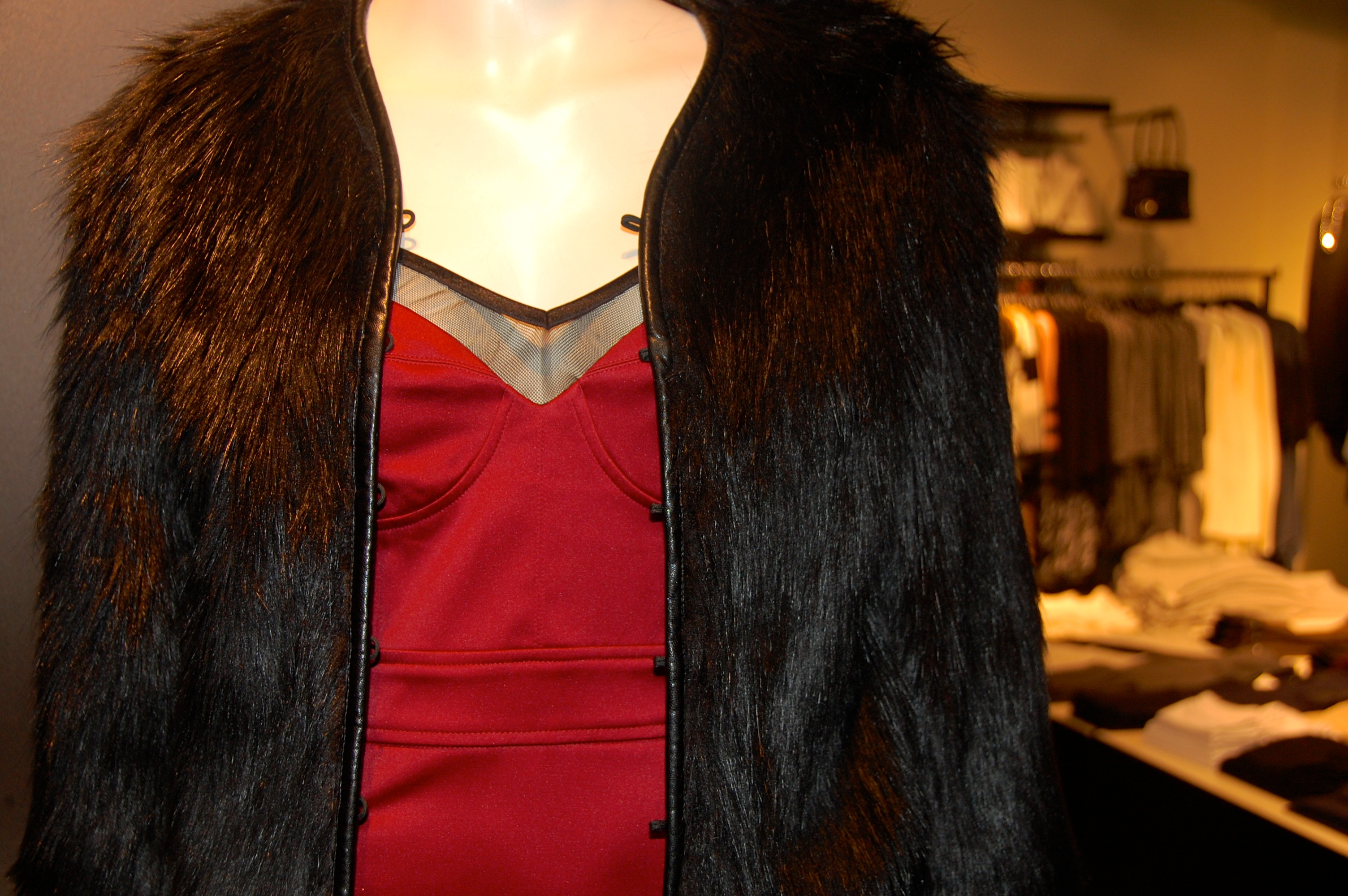
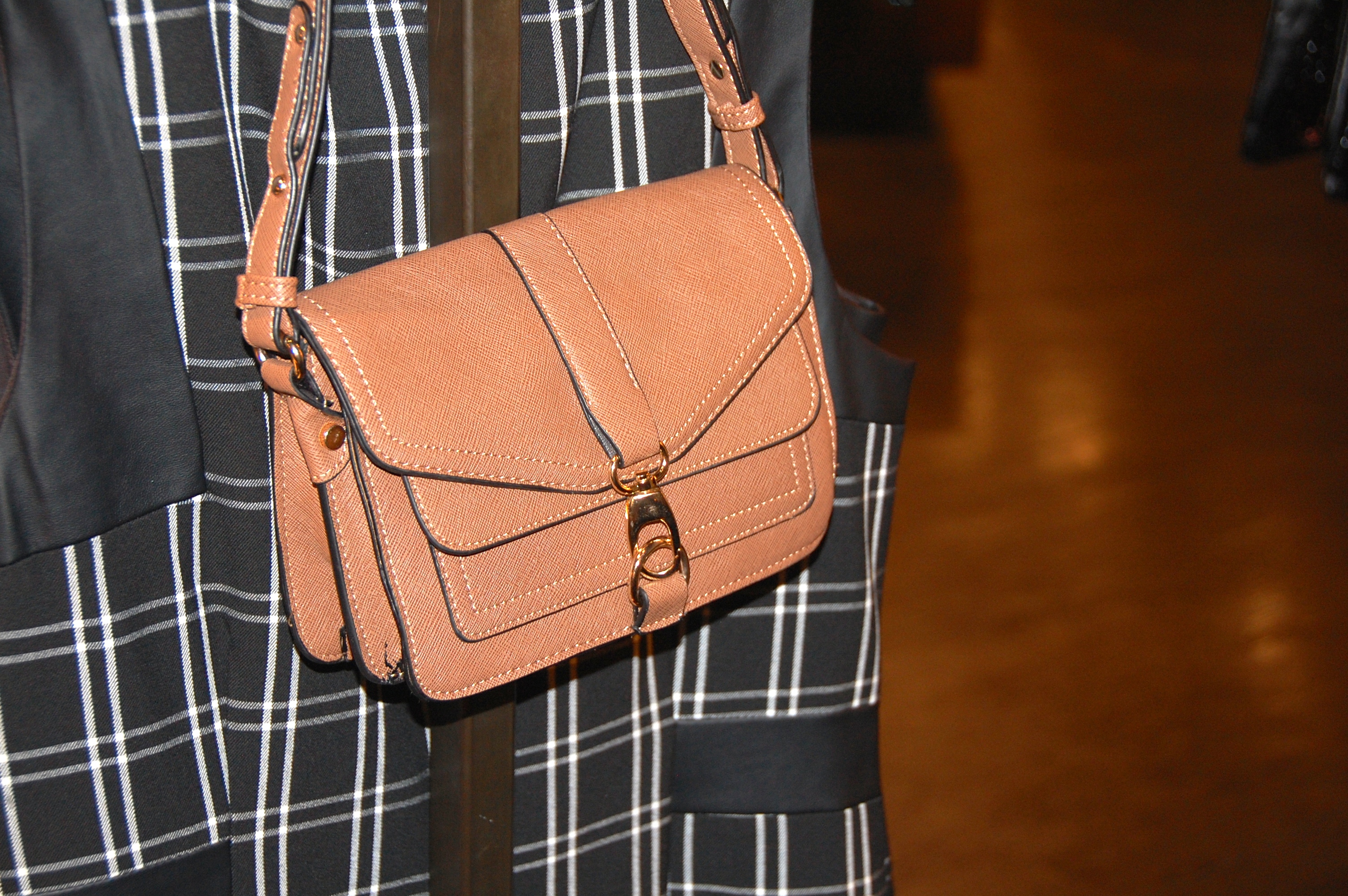
See below for images from the Eaton Centre store location and the Fall pieces that I’m lusting for!




 Follow


COMMENTS ARE OFF THIS POST